UI System Analysis
This document provides a detailed analysis of the user interface (UI) design derived from the provided reference images. The analysis focuses on both the technical structure (component-level mapping) and visual/UX strategy of the system, highlighting strengths, consistency, and improvement opportunities.
1. Reference Components Overview
The initial design reference illustrates a Kanban-style task board used for managing issues or work items.
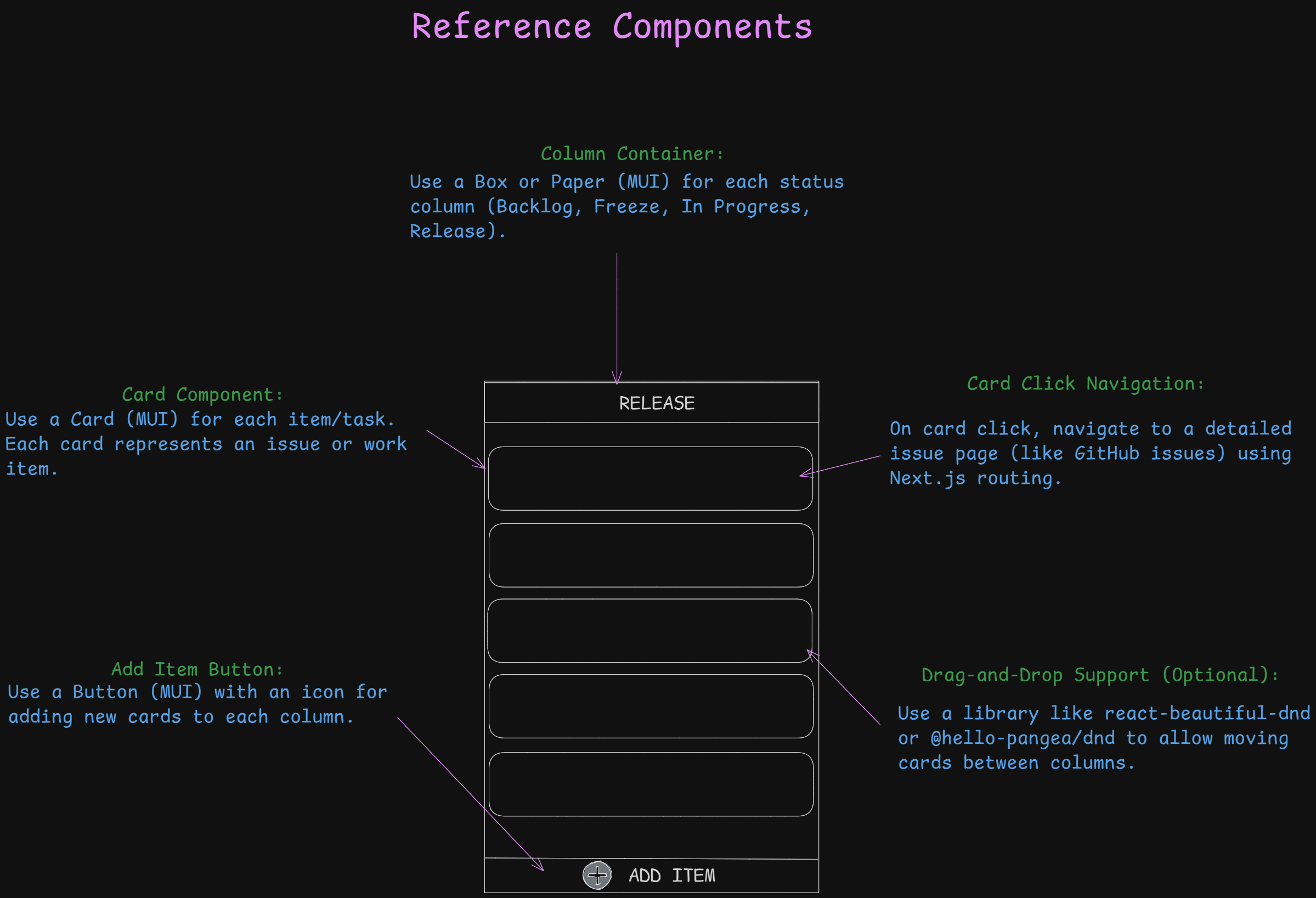
Structural Components
- Column Container:
Implemented using MUIBoxorPapercomponents to represent task columns such as Backlog, Freeze, In Progress, and Release. - Card Component:
Each card represents a work item or issue, implemented usingCardfrom MUI. Cards are stackable and visually grouped by status. - Add Item Button:
A floating or anchored MUIButtonwith an icon allows adding new tasks to the respective column. - Card Click Navigation:
Clicking a card triggers a route transition using Next.js routing to a detailed issue page (similar to GitHub’s issue navigation). - Drag-and-Drop Support (Optional):
The design accommodates the integration of libraries such asreact-beautiful-dndor@hello-pangea/dndfor rearranging cards between columns.
Visual Design & UX Notes
- Clear, minimalist layout ideal for status-based task visualization.
- Modular design allows scaling by adding columns or modifying card content.
- Simple interaction logic: Add → View → Drag/Move → Update.
- Balanced spacing and use of consistent typography support clarity.
2. Issue Board Interface (Main Issue Page)
This screen represents the active Kanban board view within the application.
Technical Composition
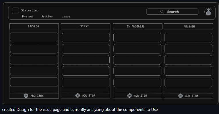
- Layout:
A responsive grid of four columns (Backlog, Freeze, In Progress, Release). Each is a reusable column component mapped to a defined state. - Navigation Bar:
Top bar with: - Company title/logo (Simtestlab)
- Tabs: Project, Settings, Issue
- Search field and avatar menu
- Column Components:
Each column dynamically renders its items (issues) via mapped state arrays. - Add Item Buttons:
Located at the bottom of each column, bound to column-specific event handlers for task creation.
UX Design Observations
- Clear column separation supports visual tracking of work items.
- The consistent “Add Item” placement improves intuitiveness.
- Balanced contrast and use of dark theme offer a professional, developer-oriented appearance.
- Search functionality in the top-right corner adds quick filtering capability.
Suggested Improvements
- Add hover tooltips for column headers.
- Enable inline editing for card titles to speed up task updates.
- Integrate card status color tags for quick recognition.
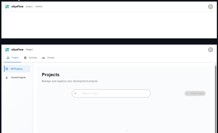
3. Project Dashboard Page (Modern View)
The Projects interface offers a structured project management panel.
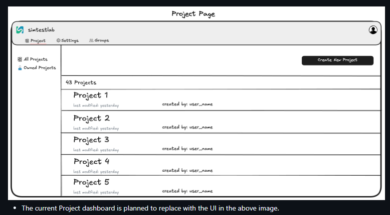
Technical Layers
- Top Navbar:
Features breadcrumb path (eSysFlow / Project / Branch) and user avatar fetched viauseSession(NextAuth.js). - Tab Navigation:
Tabs for Project, Settings, and Groups, each switching views usingTabSwitcher. - Main Panel:
Displays a searchable list of projects using MUICardorPapercontainers with responsive layout.
UX Analysis
- Clean white theme with excellent content spacing.
- Prominent “Create Project” button improves discoverability.
- Tab system encourages smooth context switching between pages.
Recommendations
- Add project metadata (owner, updated date, description) under each project card.
- Implement pagination or virtual scrolling for large project lists.
4. Project Navbar Reference Diagram
This image clarifies the Project Navbar structure and its supporting logic.
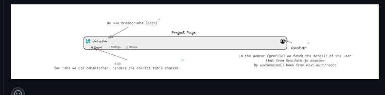
Key Functional Components
- Breadcrumbs:
Reflect the user’s navigation path dynamically using Next.js router. - Tabs:
Controlled viaTabSwitcher, determining which component renders below. - Avatar Menu:
Fetches and displays user profile info usinguseSession()fromnext-auth/react.
Technical Highlights
- All logic encapsulated within a single
index.tsxfile for modular integration. - Reusable across Project and Branch pages for unified navigation experience.
UX Considerations
- Intuitive breadcrumb and tab placement at the top enhances orientation.
- Avatar interaction placement follows common user expectations.
5. Project Page (Redesigned View)
This updated Project Page layout presents projects as a scrollable list.
Technical Mapping
- Sidebar Navigation:
Options for All Projects and Owned Projects implemented via MUIListcomponents. - Main Area:
Each project displayed as a styled card within a scrollable container. - Action Button:
“Create New Project” button positioned on the top-right corner with MUI’sButtonvariant.
UX Evaluation
- Improved readability compared to the older dashboard.
- Consistent alignment between list items maintains structure.
- The new layout aligns with modern dashboard conventions.
Suggested Enhancements
- Include visual project icons or status indicators.
- Enable quick-access dropdowns for project actions (Edit, Delete, Open).
6. Branch Page
The Branch Page extends the Project layout to show branch-level data.
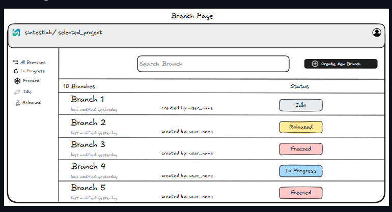
Component Structure
- Sidebar:
Filter-based navigation (All Branches, In Progress, Released, etc.). - Search Field:
Allows filtering branches by name or status. - Branch List:
Each branch card displays metadata (created by, last modified) and colored status badges. - Action Button:
“Create New Branch” positioned on the top-right for immediate interaction.
UX Design Review
- Well-defined visual hierarchy supports task discovery.
- Color-coded branch status (Idle, Released, Freezed, In Progress) effectively conveys workflow state.
- Retains consistency with the overall Project and Issue pages.
Improvements
- Consider inline branch editing for renaming.
- Add hover preview for branch details (e.g., commit summary or owner info).
7. Overall System Evaluation
Strengths
- Consistent component structure across all modules.
- Cohesive design language between Project, Branch, and Issue views.
- Strong modularity through MUI and Next.js integration.
- Scalable architecture suitable for multi-project environments.
Areas for Enhancement
- Improve microinteractions (hover, drag animations).
- Add responsive testing for small-screen layouts.
- Standardize spacing and typography for pixel-perfect alignment.
Conclusion
The UI system demonstrates a modern, scalable, and developer-friendly interface built with reusability and modularity in mind. It effectively integrates documentation-style clarity with functional design, making it suitable for professional-grade engineering management platforms like eSysFlow.