UI Analysis
Overview
This document has been updated to present the screens in the flow order . Each section contains the screenshot, a short description, and a detailed analysis covering purpose, key UI areas, interactions, accessibility considerations, and implementation notes.
Flow order (screens)
- Android Compact
- Login
- Register
- Patient Page
- Patient Details
- Species Details
- Existing Patients
- Alert Page
- Species Details 3
- Acknowledgement
- Scan Report
- Scanned Data
- Alert Page 3
Screens: detailed view and analysis
1) Android Compact
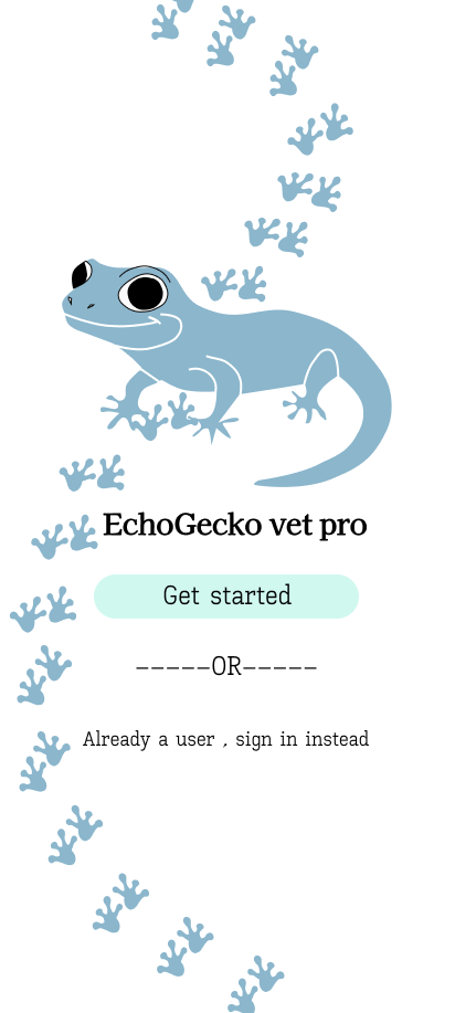
Purpose: compact mobile layout / overview for small-screen devices.
Key UI areas: - Top bar (title / navigation) - Compact content cards or list items - Floating or bottom action bar for primary actions
Visual hierarchy: - Title/top bar > primary action buttons > content list/cards
Primary interactions: - Tap to open items, swipe to reveal actions (if supported), bottom action for add/scan.
Accessibility: - Ensure touch targets >=44px, provide visible focus states, and readable font sizes on small screens.
Implementation notes: - Use a responsive single-column layout. Implement with a mobile-first CSS approach (Flexbox/Grid). - Components: TopBar, CompactList, CompactCard, BottomActionBar.
Data & props to expose: - items: [{id,title,subtitle,status,meta}], onItemPress(id), onPrimaryAction().
2) Login
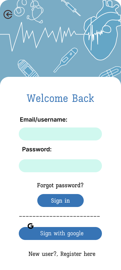
Purpose: Authenticate users to gain access to the application.
Key UI areas: - Email/username field, password field, primary sign-in button - Secondary actions: forgot password, register link
Visual hierarchy: - Primary CTA (Sign in) is visually prominent; inputs stacked vertically.
Primary interactions: - Form input, show/hide password, disabled state when fields invalid, submit via keyboard.
Accessibility: - Label every input (aria-label), ensure error messages are announced, use logical tab order.
Implementation notes: - Validate client-side, show inline errors, and call an authentication API. - Components: AuthForm, InputText, PasswordInput, Button, Link.
Security notes: - Avoid logging passwords; use secure storage for tokens and implement server-side rate limiting.
3) Register
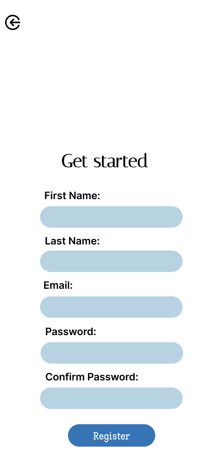
Purpose: Create new user or patient accounts.
Key UI areas: - Fields for name, credentials, metadata (e.g., DOB), CTA to submit - Secondary guidance text and link to login
Visual hierarchy: - Form fields > primary create/register CTA > secondary links
Primary interactions: - Form validation, captcha or bot protection, progress indicator on submit.
Accessibility: - Provide clear field labels and guidance, use aria-describedby for helper text.
Implementation notes: - Components: RegisterForm, Input, Select, DatePicker, Button. - Ensure server-side validation mirrors client validations.
4) Patient Page
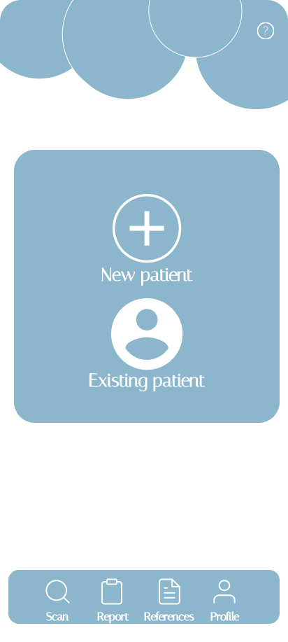
Purpose: Dashboard/listing for a patient — overview of status and recent activity.
Key UI areas: - Patient summary card, recent events/activity list, primary actions (edit, scan, share)
Visual hierarchy: - Summary card with key vitals > activity feed > action buttons
Primary interactions: - Tap to view details, expand/collapse sections, trigger actions (scan/report).
Accessibility: - Ensure semantic headings and region landmarks; make actions keyboard-accessible.
Implementation notes: - Components: PatientSummary, ActivityList, ActionStrip. - Consider lazy-loading heavy sections (charts or reports).
5) Patient Details
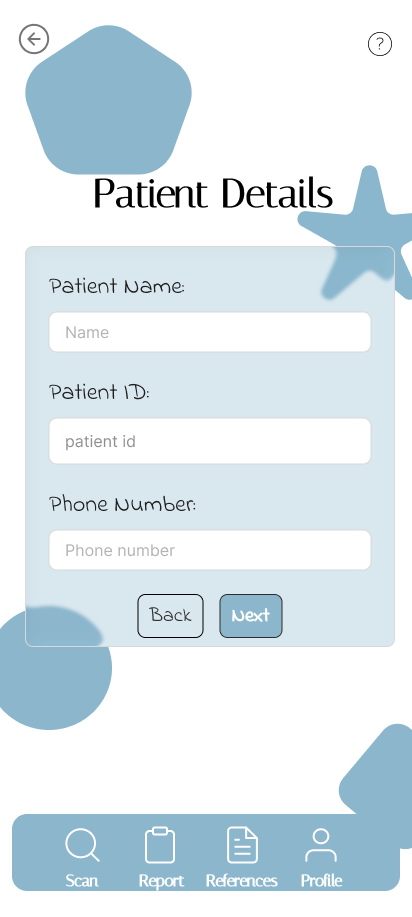
Purpose: Full detail view for an individual patient record.
Key UI areas: - Header with patient name and quick metadata (age, ID) - Tabbed or stacked sections: vitals, history, notes, documents
Visual hierarchy: - Header > critical vitals > tabs for related data
Primary interactions: - Edit fields, add notes, attach documents, navigate between tabs.
Accessibility: - Use aria-labelledby for sections; ensure form controls have labels and error messages.
Implementation notes: - Components: DetailsHeader, DetailsTabs, EditableField, Timeline. - Provide optimistic UI for inline edits with background sync.
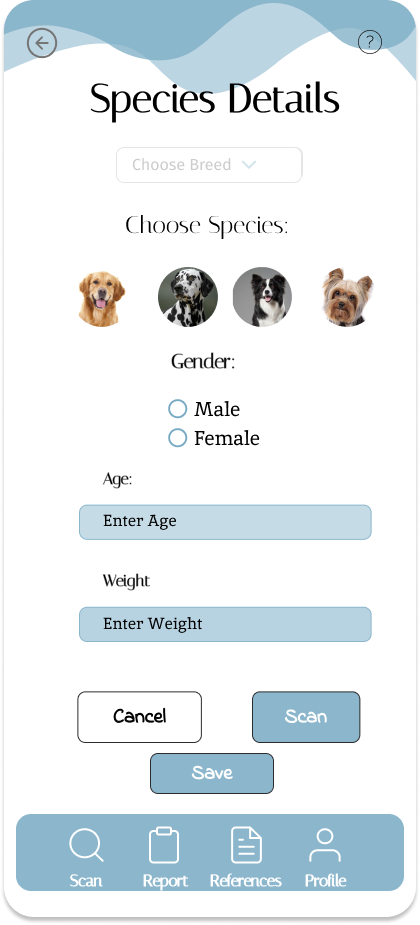
6) Species Details
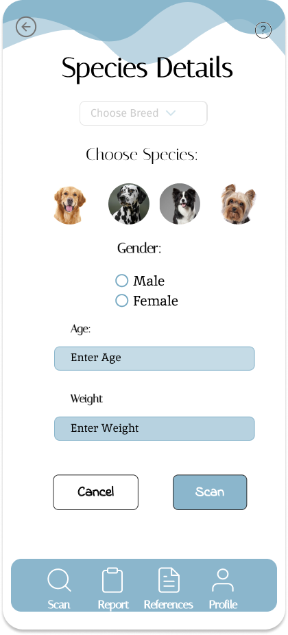
Purpose: Display details related to a selected species (domain-specific content).
Key UI areas: - Title, attributes table or cards, images, related records.
Visual hierarchy: - Title and key attributes > detailed attributes and related items
Primary interactions: - Expand/collapse attributes, navigate to related items, images modal.
Accessibility: - Provide descriptive alt text for any images and semantic markup for data tables.
Implementation notes: - Components: EntityHeader, AttributesGrid, RelatedList, ImageModal.
7) Existing Patients
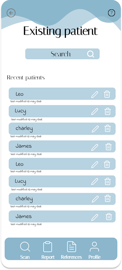
Purpose: Searchable list or index of patients already in the system.
Key UI areas: - Search/filter bar, list items with summary, pagination or infinite scroll.
Visual hierarchy: - Search/filter > list > individual item actions
Primary interactions: - Search, filter, sort, open patient, bulk actions.
Accessibility: - Ensure list items are accessible as list role; label list controls clearly.
Implementation notes: - Components: SearchBar, PatientList, PatientListItem, BulkActionBar. - Use server-side filtering for large datasets.
8) Alert Page
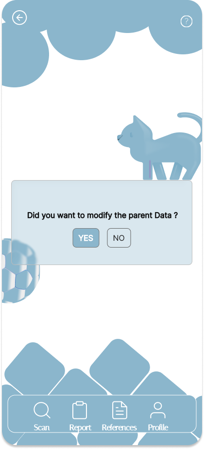
Purpose: Surface important alerts or warnings to the user.
Key UI areas: - Prominent alert header, context/details area, actions to acknowledge or escalate.
Visual hierarchy: - Alert title > severity badge > details and actions
Primary interactions: - Acknowledge, dismiss, view history, navigate to affected patient/item.
Accessibility: - Use ARIA role="alert" for urgent messages; ensure colors are not the only indicator of severity.
Implementation notes: - Components: AlertCard, SeverityBadge, AlertActions, AlertHistory.
9) Species Details 3
Purpose: Variant/detail view of species (different layout or additional fields).
Key UI areas: - Extended attributes, variant-specific content, attachment area.
Visual hierarchy: - Key identifiers > extended attributes > attachments/notes
Primary interactions: - Switch between variants, open attachments, edit metadata.
Accessibility: - Maintain consistent semantics with the other species page; ensure contrast for variant indicators.
Implementation notes:
- Reuse SpeciesDetails components and pass a variant prop to toggle layout.
10) Acknowledgement
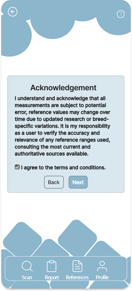
Purpose: Confirmation screen after a completed operation (e.g., registration or report submission).
Key UI areas: - Confirmation message, reference ID, next steps (buttons/links).
Visual hierarchy: - Strong success icon/message > reference details > next actions
Primary interactions: - Copy reference ID, navigate back to dashboard, download receipt.
Accessibility: - Announce success message via aria-live, include clear copy for screen readers.
Implementation notes: - Components: SuccessPanel, CopyButton, NextStepsList.
11) Scan Report
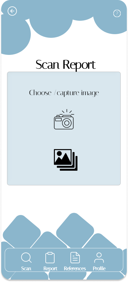
Purpose: Present results of a scan operation and provide export/share options.
Key UI areas: - Summary header, result sections (pass/fail), graphs or data tables, export controls.
Visual hierarchy: - Report summary > critical failures > detailed logs
Primary interactions: - Expand details, export PDF/CSV, share or flag items.
Accessibility: - Tables should have proper headers; charts should include text summaries.
Implementation notes: - Components: ReportHeader, ReportSections, ExportControls, LogViewer.
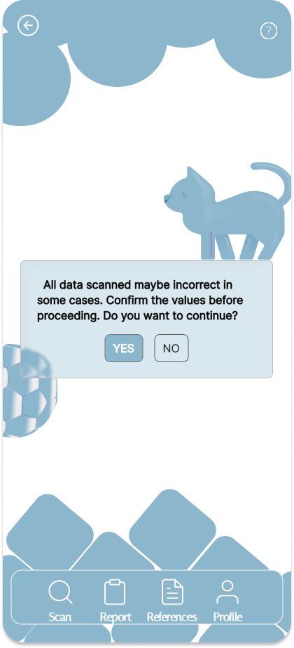
12) Scanned Data
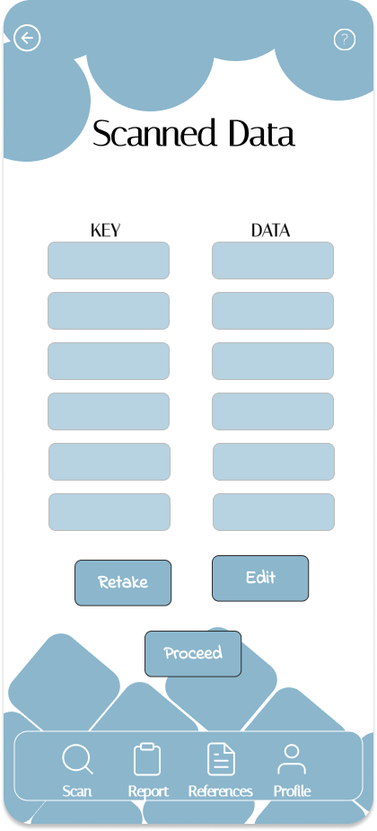
Purpose: Show raw or processed scan data that was captured by the system.
Key UI areas: - Data table/grid, filters, timestamp and metadata.
Visual hierarchy: - Filter controls > data table/list > row actions
Primary interactions: - Filter, sort, view row details, export selected rows.
Accessibility: - Ensure tabular data has clear headers and keyboard navigation.
Implementation notes: - Components: DataTable, FilterBar, RowDetailsPanel. Use virtualization for large datasets.
13) Alert Page 3
Purpose: Alternate alert view (another severity or context).
Key UI areas: - Context-specific details, recommended actions, acknowledgment controls.
Visual hierarchy: - Severity indicator > recommended action CTA > detailed context
Primary interactions: - Escalate, acknowledge, link to affected entities.
Accessibility: - Use aria-live and role="alertdialog" if user response is required.
Implementation notes:
- Maintain a consistent alert component API; pass severity and actions props.
Overall implementation recommendations
- Use a component-driven approach: small, focused components (TopBar, PageShell, DataTable, FormInput, Modal).
- Centralize data fetching (hooks or services) and use caching for lists (e.g., React Query).
- Prioritize accessibility: semantic HTML, ARIA where needed, high-contrast modes, keyboard support.
- For images: consider moving to an
images/subfolder if you plan to add many more assets; update links accordingly.
If you'd like, I can:
- Move all images into images/ and update links.
- Rename files to remove spaces and update links.
- Generate a compact gallery view or a printable Markdown/Word-friendly export layout.
Updated: images referenced by their exact filenames in the same folder and screens ordered as requested.