TASK MANAGER
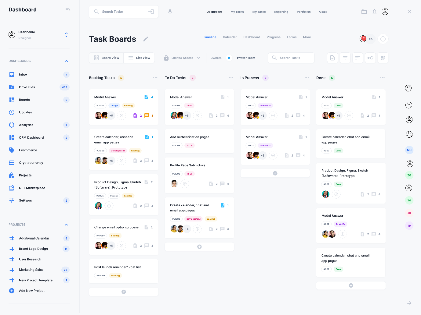
Reference Image
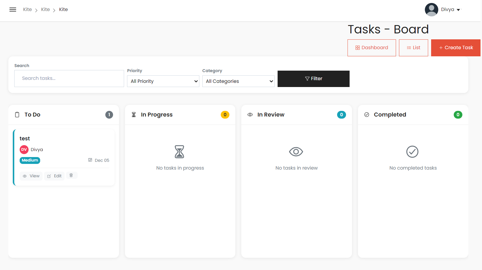
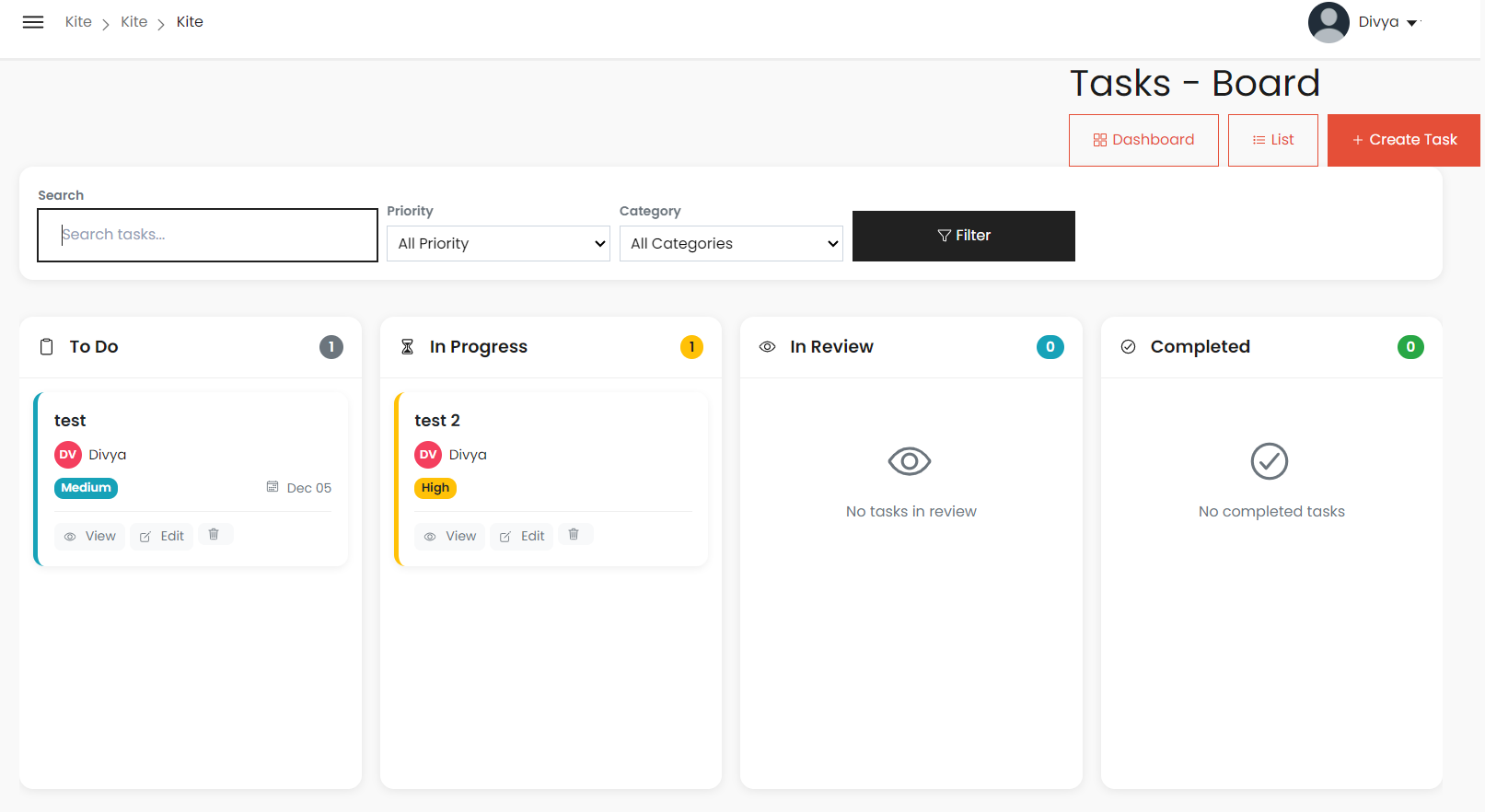
Current Implementation
Similar Features
1. Layout & Structure
- Kanban board layout with multiple columns for task stages
- Columns for: To Do, In Progress, Review, Done
- Tasks displayed as draggable cards within columns
- Top navigation bar with search and filter options
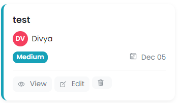
2. Task Card Elements
- Task titles shown clearly
- Assignee avatars
- Priority / Category colored labels
3. Header Elements
- Board title displayed at the top
- View switching options (Dashboard/List)
- “Create Task” button
- Filters for category, priority, and search
Differences
1. Column Structure
- Sample: Backlog, To Do, In Process, Done
- Current: To Do, In Progress, In Review, Completed
- Missing a Backlog stage
2. Task Card Details
Missing in Current:
- Task IDs (e.g., #U007, #U051)
- Multiple assignees with “+5” indicator
- Attachment icon (paperclip)
- Comment count indicators
- Subtask counts (e.g., 2/4)
- Priority icons (flags, pins)
- Multiple tags per task (Design, Backend, Development)
Present in Current:
- Due date
- View, Edit, Delete actions
3. View Controls
Missing in Current UI:
- Board/List toggle
- Limited access indicator
- Owner display
- Team label (e.g., “Twitter Team”)
- Additional filtering options
4. Visual & UI Elements
Missing:
- Team member count (e.g., “+5”)
- Tab navigation (Timeline, Calendar, Dashboard, Progress, Forms, More)
Issues in Current Build
- Categories – options are to be included
- Navigation to task board when ‘tasks’ in sidebar is pressed.
- When the ‘view’ button is pressed in the task card, the ‘close’ button does not work. Also ‘Cancel’ for task update does not work.
- UI in list view (for edit options)
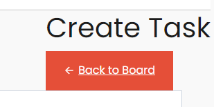
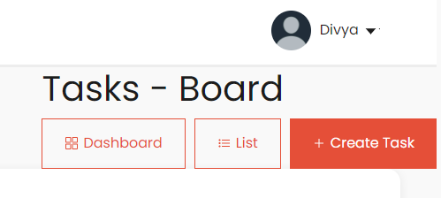
- Buttons like ‘create task’ are in the edge of the screen, similarly ‘back to board’ also it even overlaps.
Files Overview
1. task_kanban.html – Kanban Board View
Header
- Page title: Tasks – Board
- Navigation: Dashboard / List / Create Task
- Filters: Search, Priority, Category
Columns
- To Do
- In Progress
- In Review
- Completed
Each column includes:
- Icon + Title
- Task count badge
- Empty-state messages when no tasks
2. task_kanban_card.html – Task Cards
Used inside: task_kanban.html
Card Elements
- Task title
- Assignee avatar
- Priority badge (Low, Medium, High, Urgent)
- Due date with calendar icon
- Actions: View / Edit / Delete
- Draggable to change status
3. task_view.html – List View
Header
- Page title: Tasks – List
- Navigation: Dashboard / Board / Create Task
Statistics Pills
- Total tasks
- To Do
- In Progress
- In Review
- Completed
Filters
- Search
- Status
- Priority
- Category
- Filter button
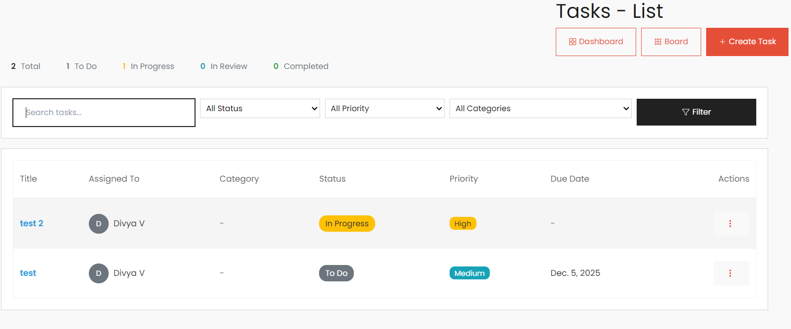
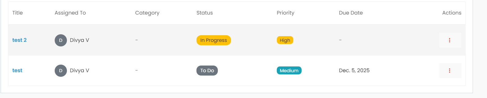
4. task_list.html – Table Component
Used in: task_view.html
Table Columns
- Title (click to open details modal)
- Assigned To (avatar + name)
- Status badges
- Priority badges
- Due Date (highlight overdue)
- Actions dropdown:
- View
- Update Status
- Edit
- Move Category
- Delete
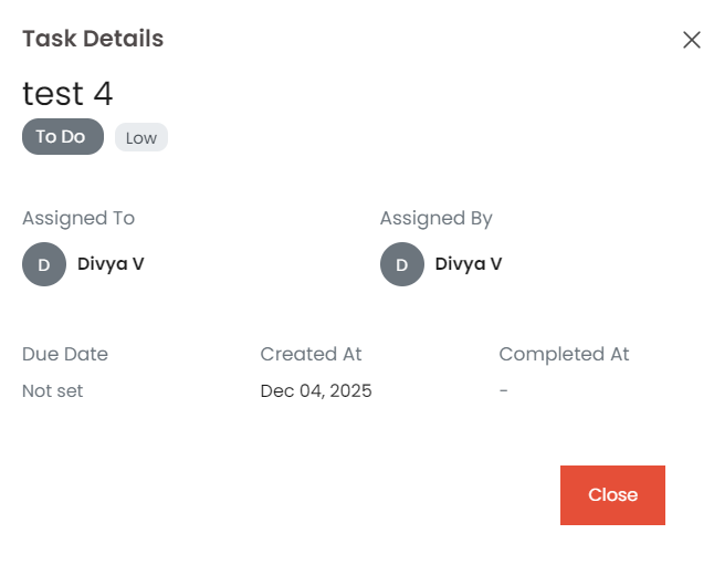
5. task_detail.html – Task Details Modal
Triggered by: View button
Modal Includes
- Task title
- Status badge
- Priority badge
- Description
- Assigned To / Assigned By
- Due Date
- Created At
- Completed At
- Close button
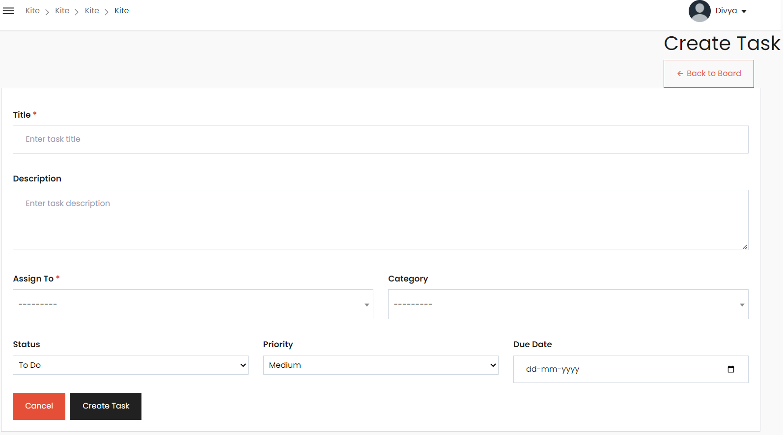
6. task_form.html – Create/Edit Task Form
Triggered by: Create Task / Edit
Fields
- Title
- Description
- Assign To
- Category
- Status
- Priority
- Due Date
Buttons
- Cancel
- Create / Update Task
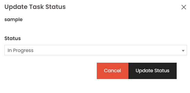
7. task_status_form.html – Quick Status Update Modal
Triggered by: Update Status dropdown
Includes
- Task title
- Status dropdown
- Cancel
- Update Status
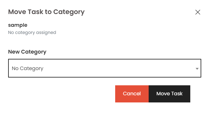
8. task_move_form.html – Move Category Modal
Triggered by: Move Category action
Includes
- Task title
- Current category
- Category dropdown
- Cancel
- Move Task
MUI Components Used
1. Box
Description:
Box is a wrapper component that provides access to the MUI System. It
is used for layout, spacing, backgrounds, borders, and flexbox.
Code Snippet:
import Box from '@mui/material/Box';

<Box sx={{ p: 2, bgcolor: 'grey.100' }}>
  Content goes here
</Box>
2. Paper
Description:
Paper provides a material-like surface with elevation (shadow). Useful
for cards, containers, and content sections.
Code Snippet:
3. Typography
Description:
Typography is used for text rendering with predefined variants such as
h1--h6, subtitle, body, caption, etc.
Code Snippet:
import Typography from '@mui/material/Typography';

<Typography variant="h6">Title</Typography>
<Typography variant="body2">Description text</Typography>
4. Chip
Description:
Chip is used to display small blocks of information like tags,
statuses, or categories.
Code Snippet:
5. Avatar & AvatarGroup
Description:
Avatar displays a profile image or initials.
AvatarGroup groups multiple avatars with overflow handling.
Code Snippet:
import Avatar from '@mui/material/Avatar';
import AvatarGroup from '@mui/material/AvatarGroup';

<AvatarGroup max={4}>
  <Avatar src="https://i.pravatar.cc/40?img=1" />
  <Avatar src="https://i.pravatar.cc/40?img=2" />
</AvatarGroup>
6. Stack
Description:
Stack arranges elements vertically or horizontally with spacing
control. Perfect for layout inside cards.
Code Snippet:
import Stack from '@mui/material/Stack';

<Stack direction="row" spacing={2}>
  <div>Item 1</div>
  <div>Item 2</div>
</Stack>
7. IconButton
Description:
IconButton is used for clickable icons (e.g., menus, settings, more
options).
Code Snippet:
import IconButton from '@mui/material/IconButton';
import MoreVertIcon from '@mui/icons-material/MoreVert';

<IconButton>
  <MoreVertIcon />
</IconButton>
8. Material Icons
Description:
Icons from @mui/icons-material provide visual cues for actions like
chat, files, or status.
Code Snippet:
import ChatBubbleOutlineIcon from '@mui/icons-material/ChatBubbleOutline';
import InsertDriveFileIcon from '@mui/icons-material/InsertDriveFile';
import CheckCircleIcon from '@mui/icons-material/CheckCircle';

<ChatBubbleOutlineIcon />
<InsertDriveFileIcon />
<CheckCircleIcon />
9. Button
Description: A clickable element used for actions such as submitting forms or triggering events.
Code Snippet (official-style):